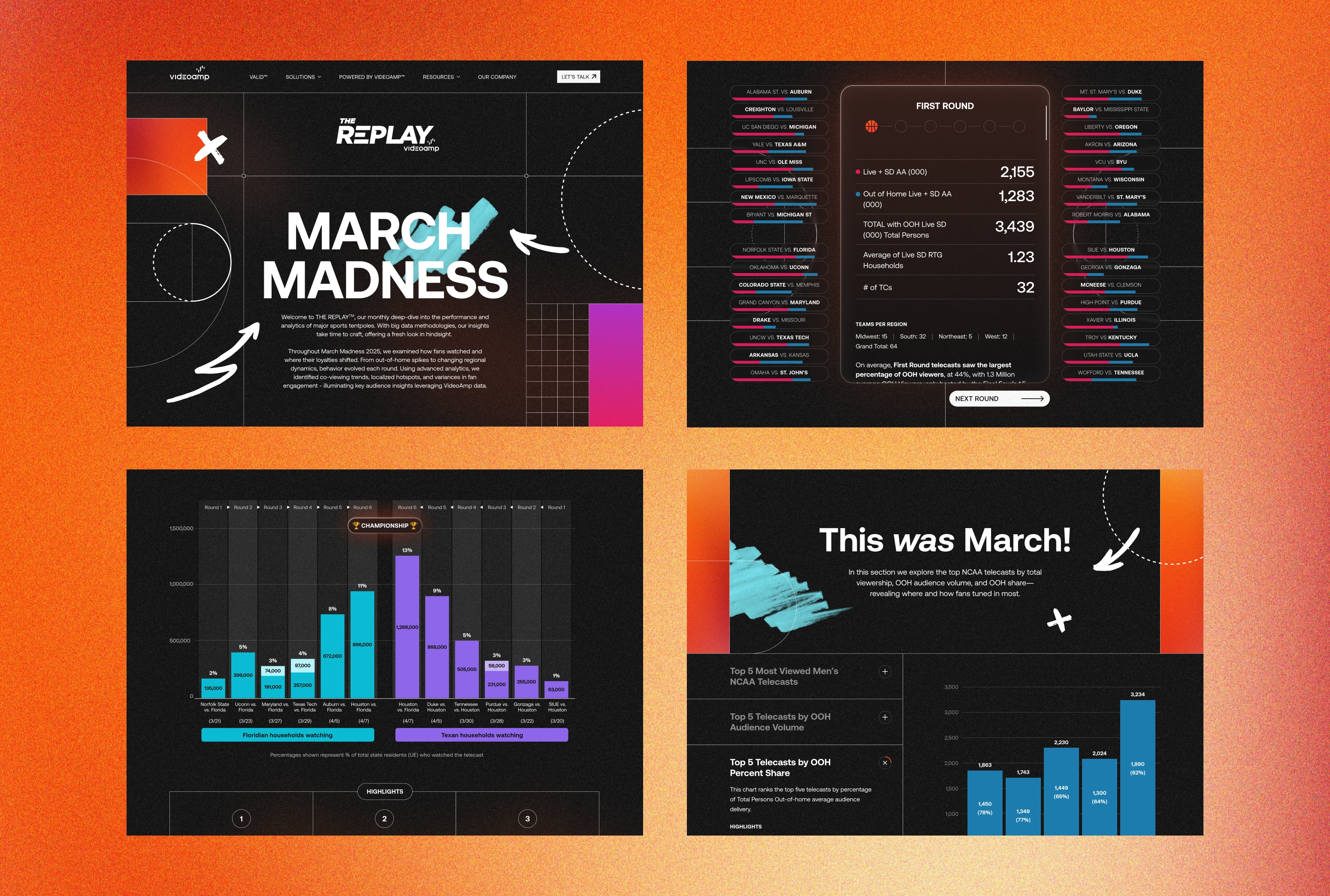
Project Overview
The Brief
VideoAmp is a media measurement and optimization software company that helps marketers optimize their media investment, by creating a more valuable and data driven ecosystem that redefines how media is valued, bought & sold. Three years after the launch of their website, VideoAmp sought to refresh their online presence to communicate a revitalized brand story and differentiate themselves from competitors, while retaining the core elements of their brand style guide.
The mission was to craft a new aesthetic that felt both fresh and familiar, resonating with their audience while reflecting their brand identity. VideoAmp sought a design that encapsulated the boldness, innovation, and trailblazing spirit that defines the company, ensuring that the new look truly represented their ethos. Among the objectives was also the incorporation of fun and hidden easter eggs throughout the site, creating unexpected delightful moments for users. These playful elements served as a nod to VideoAmp's vibrant company culture, allowing their spirit to shine through.
One of the challenges of this project was working within the constraints of an existing site structure and content. But rather than a limitation, this was also an opportunity and a creative endeavor to figure out ways to use the power of layout and typography to create a fresh and bold visual style that breathed new life into the site, within the given constraints. I contributed as the main web designer on this project, collaborating closely with an art director, producer, and developers at Column Five Media.
The Solution
This website refresh introduces a fresh take that reflects VideoAmp's ethos: Clarity in data-driven advertising. To echo this commitment, the new aesthetic features a bold and minimal style, embracing a modern black-and-white foundation for the site's design with deliberate splashes of color emerging dynamically through interactive elements. These elements engage users while maintaining focus on core content, merging boldness with simplicity and staying true to the company's core values.
The site's aesthetic strikes a balance between bold minimalism and unexpected moments of interaction, mirroring VideoAmp's dynamic culture. Fun easter eggs and hover effects subtly weave in the company's vibrant spirit, while animations and scroll effects add depth and movement to the user experience.
Incorporating employee-centric videos, imagery, and culture content throughout the site also serves a dual purpose: educating visitors about VideoAmp's offerings and fostering a deeper connection by showcasing the people behind the brand. This seamless integration of brand identity and company culture ensures a cohesive brand messaging and compelling user experience.
To craft a captivating hero section for the homepage, we introduced a transparent 3D polygon element as an interactive feature. Positioned on top of the hero headline, this element subtly deconstructs the headline with slow rotation animations, symbolizing VideoAmp's commitment to transforming ambiguity into clarity in the realm of data-driven advertising. Its dynamic response to cursor movements adds an engaging layer for users. Additionally, users can further engage by clicking and holding the 3D element, triggering faster spinning and vibrant color changes. For enhanced accessibility, we included an option to toggle this feature off.
The website refresh embodies VideoAmp's ethos, driving significant user engagement and achieving an 850% monthly MQL increase, surpassing the 200% goal, while also receiving an Awwwards Honorable Mention and a Mobile Design Excellence Award.


Company Culture
Easter eggs and culture-focused sections were introduced to the site as a nod to VideoAmp's vibrant company culture, showcasing its spirit while providing valuable information. Incorporating employee-centric videos, imagery, and cultural content serves a dual purpose: educating visitors about VideoAmp's offerings and connecting them with the people behind the company. Users are invited to explore not only VideoAmp's innovative solutions but also its diverse talent and culture.
The team-specific pages highlight the different teams and talent at VideoAmp, along with details about workplace perks and programs. Additionally, users will find information about how to join VideoAmp, including sections that describe the hiring and interview process, along with easter egg moments, such as a hidden button in the footer revealing fun facts about VideoAmp.
These culture-focused sections strike a balance between professionalism and playfulness, reflecting VideoAmp's ethos of innovation and inclusivity. With engaging design and informative content, they reinforce VideoAmp's position as an industry trailblazer while welcoming users into its vibrant company culture.
.gif)


